Showing posts with label art supplies. Show all posts

Monday, June 21, 2021

Mounting Watercolor Art Onto Wood Panels


The other day I mounted four of my watercolor paintings onto cradled wood panels and I thought it would be a great opportunity to share with you what I have come to regard as my favorite way of turning my watercolor art into something you could hang on a wall.

I didn't know this was possible a couple years ago because watercolor is a fairly fragile artform and is usually protected using a mat and frame.  Which can kind of get expensive, especially if your art is large or a custom size or shape.

A tub of Dorland's Wax Medium
What really makes the whole thing possible is a cold wax and resin product called Dorland's Wax Medium, which is used as the final layer applied over the painting after it is mounted.  This provides the protection needed for the painting.  As long as you keep the painting indoors, I guess.  It doesn't really change the look or character of the watercolor painting.  The finish is matte, which I like, but as I understand it can be buffed once it's dry to a more glossy finish.  I like the look of it!  If I am not mistaken, it seems like it makes all the colors in my painting just a little more vibrant.

Why else do I like it? 
  • Like I said, it's less expensive than traditional framing methods when the art is large or is an odd size or shape (such as square -- it's so hard to find square mats and frames!).
  • I love the immediacy, the accessibility, of the art for the viewer.  It's no longer behind glass or acrylic.
  • This method provides a clean line and look to the art.  There is not the bulk of the frame around it.  I do still enjoy the look of matted and framed art, but this has an attractive aesthetic as well.
10x20"

If you are ready to entertain this idea, I can point you to a couple of videos which are excellent demonstrations of the process:

1.  The video that first introduced me to the idea was by Annie Strack.  The video demonstrates the usefulness of this method for tryptics:  https://youtu.be/rMAJnDhTpDc

2.  A more recent video, also an excellent demonstration  with a lot of detailed information, is by Angela Fehr:  https://youtu.be/XHeDltkj9_M

These two videos are pretty consistent with each other in their process.  The one thing Angela does (that I do not do) is to first spray the painting with an acrylic varnish before applying the Dorland's Wax for an extra measure of protection.


Materials Needed:  
  • 20x30" painting smaller than the panel
    Your watercolor painting!  One tip is to make the painting slightly larger than your wood panel.  After you mount your painting to the wood panel you will use a craft knife to cut the paper flush with the panel; this results in a clean edge and a more professional look.  It's not required though, I have mounted paintings that were smaller than the panel.  This is okay as long as the paper has a nice clean edge (or nice deckled edge, if that is your taste).
  • Wood panel.  I like cradled wood panels with about 1 1/2" depth.  I have ordered 6x6" panels from Dick Blick (I like the Blick Studio just fine), but I have a local friend who hand makes panels for sale and I like to use them too when I need larger sizes.  You have options for finishing the wood panels.  I have left them to a natural wood finish (coated with the Dorland's as I coat the painting itself) or painted them with wood stain or acrylic matte black spray paint before mounting the painting onto it.  A good breakdown of your finishing options is on a blog post by Ampersand.  
  • Gel medium.  This serves as an acid-free glue to mount the painting onto the wood panel.  I am currently using Liquitex Matte Gel Medium. I use an inexpensive brush to apply.
  • Brayer.  Assists in mounting the painting flat to the wood panel.
  • Heavy books.  To ensure the painting dries flat to the panel as the gel medium dries.
  • Exacto knife. Used to cut the painting flush to the wood panel once gel medium has dried.  As Angela does in her video, I smooth out the edge of the painting with sandpaper (400 grit) as needed.
  • Dorland's Wax Medium.  The magic stuff to seal and protect your watercolor painting.  When I was first trying out this method I bought the 4oz jar, and when I got hooked on this method and finished the small jar I bought a 16oz jar.
  • Hanging hardware.  I drill holes 1/4 to 1/3rd distance from top, insert screw eyes and attach picture wire.  A video I like about attaching the picture wire is here:  https://youtu.be/0YTdphzDHTY
I highly advise you to watch the process videos I have linked, but here are my basic steps for the process:

1.  Make your painting.  As I mentioned, it is helpful to paint it slightly larger than your panel (on the order of 1/8-1/4") in all dimensions.  That way there is a little lip of paper that can be trimmed flush to your panel after you mount it.  Another tip, I paint with my paper taped to a support board, or use a watercolor block.  This helps prevent warping of the paper which is helpful for mounting it nice and flat to the panel.  If your paper does warp or buckle, it seems like it'd be good to flatten your painting before trying to mount it.  

2.  I like to mark an outline of the panel with pencil onto the back of the painting.  This helps me position it more accurately when it it's time to glue it.

3.  Brush the gel medium evenly onto the top surface of the panel.  Be sure to get the corners.  Wipe off any excess that ended up on the sides of the panel.  With the painting facing down, I place the panel onto the backside of the painting, using my penciled-in outline as a positioning guide.  I press down gently, and wipe off any excess glue I see that has seeped at the edges with a paper towel.

4.  Carefully flip the painting + panel so the painting is up.  Use the (clean!) brayer over the surface of the painting to flatten it and ensure contact of all the painting to the panel.  Start generally from the center of the painting and work your way out to all edges.  As Angela demonstrated in her video, I like to push the edges of the paper down, bending it slightly over the edge.  I want good glue contact especially along the edges and corners.  

5.  Carefully flip the painting + panel back upside down.  Check again for any gel medium seepage along the edges and wipe off.  Next is to stack books on top of the panel to provide some weight to ensure good contact as the gel medium dries.  For each of these small 6x6" paintings I recently mounted, I used a hardcover book, then stacked a 15 lb dumbbell on top of that.  Let sit for several hours, overnight is recommended.

6.  Once the gel medium is dried I trim away the lip of excess paper around the edges using an exacto knife and a cutting mat.  You'll discover why I mention wiping away glue that has seeped out along the edges; paper is easier to cut through than a blob of dried glue.  It's hard to be super precise with the knife, that is why it's handy to follow up with a bit of sand paper (about 400 grit).  Be careful to not sand away your stain or paint on the panel sides.  It doesn't usually take much sanding to get a smooth even edge.  Wipe away any dust from sanding.

7.  Apply the Dorland's Wax Medium.  Angela uses a lint-free cloth, but I like to use my bare fingers so I can get a better sense of how much I am applying, and can feel if I have good even coverage.  I dip my fingers into the jar for a dollop of wax, at least a marble-sized amount.  I then rub the wax over the surface of the painting in mostly circular motions, as well as the sides of natural or stained panels (ones painted with acrylic don't need the wax protection).  You only need a thin layer, but you want it all covered.  You'll be able to tell by feel if you have all surfaces covered; you'll feel some resistance under your fingers for the areas lacking wax.  There is a slight milkiness to how it will look, and you will see texture from your strokes.  Don't worry.  As the wax cures it becomes fully transparent and becomes more smooth.  Allow several hours to cure as you did for the glue.  If you want a more glossy shine, you can buff the surface with a cloth, but I never do.  You can do a second layer, but I never do.

8.  The last step is to install the hanging hardware to the back of the panel.  Then...ready to hang!

3" Ornaments

I have also used this mounting and sealing technique onto 3" wood disks for ornaments, it's pretty cool!

I hope this post has opened new avenues for displaying your art.  It provides an option that perhaps you have never considered before.  While this method is certainly more work than traditional framing techniques, the results in my opinion are very beautiful.  


Thursday, May 2, 2019

Delicate Arch Under a Starry Night Sky - Step-By-Step

Delicate Arch Under the Stars, 5x7"
I painted this watercolor of Delicate Arch under a starry night sky in preparation for teaching my "Skies In Watercolor" class at the Art Verve Academy This coming Saturday I will teach the session on how to do starry night skies.  When I first learned how to do these kinds of skies myself (thanks to a YouTube demo by Untamed Little Wolf), I fell in love with this way of treating the sky and transforming what would otherwise be an ordinary painting into something I felt was magical.  When I was a teenager first discovering the night sky after having moved from a city to the country, I grew so enamored with it I thought I wanted to be an astronomer!  (Watching Carl Sagan's Cosmos series on TV also provided further inspiration).  Alas I never became an astronomer, but now many years later I can channel my romance with the night sky into art!  I found it can even be done in watercolor (with the help of a little bit of white gouache).

I want to show you a step-by-step in how I created this little painting.


Materials Used:
- Paper:  Arches 140lb Cold Press watercolor paper
- Paints:  DS New Gamboge, DV Red Rose Deep, MG Quinacridone Rust, MG Ultramarine, MG Quinacridone Violet, WN Winsor Violet, and WN Paynes Grey, WN Permanent White Gouache
- Brushes:  Silver Black Velvet rounds 16 and 8, bristle brush
- Ink lines:  Rapidograph .30 w/ Rapidograph Ultradraw Black India ink

 The first step is to choose a subject to put under your starry night sky.  You have a choice of creating a silhouette image of landscape features like mountains or trees (like in Untamed Little Wolf's video, linked above), or use a reference photo from a photo taken in daylight and turn it into a night scene.  To do the silhouette is more in line with how our eyes, and most cameras, would actually sense the scene.  It's the nature of the limited dynamic range of our vision, and especially of cameras.  There is an element of realism in that approach.

But what if you had eyes that could see BOTH the stars and colorful nebula gas of the night sky AND had good enough night vision to see the landscape features in all the glory of color and light?  Maybe we could even see the "aura" of a place...  Wouldn't that be magical?  I think so, and that is why I've fallen in love with this approach!

Reference Photograph
Pencil Drawing
I have found that I really enjoy turning reference photos of interesting landscape subjects -- even if photographed under an ordinary blue or overcast sky -- into an imaginative and fanciful painting of a special place under a starry night sky.  In this case I chose Delicate Arch from a trip a few years ago.  We had hiked the 1.5 miles to watch the glow of the setting sun on the arch.  I traced the photograph to get the pencil lines onto the watercolor paper.  I like to tape my paper to a plexiglass sheet, in this case using blue painter's tape.

First and second wash
Since starry night skies use such dark and intense pigment, I find it best to paint (most of the) landscape features before painting the sky so I don't run the risk the sky bleeding into my landscape if my damp brush happens to touch the sky.  So my first washes were on the arch and the distant land ridges.  I like my first wash to be more of an underpainting of rose and warm yellow tones; I learned this trick from artist Jonathan Frank and I like how the underpainting creates a rosy glow to the landscape.  I apologize for forgetting to photograph after making the underpainting, but in the photo at left you can see remnants of the rose and gold tones.  On the arch, I didn't bother to stay within the lines.

After the underpainting dried, I did a second wash on the arch itself to lay down the lighter tones of the local color.  I did drop in darker tones (a bit of violet) for the areas destined to be deep in shadow.


Though I normally would further develop the landscape before painting the sky, I decided in this painting to paint the sky next.  As my up-coming class was focused on the sky, I wanted to make sure I dusted off my technique for the sky ASAP to be ready to teach it.

Wet the sky area with clear water
Drop in warm yellow and rose for the horizon

As we are working the sky wet-into-wet, the first step is to wet the sky area with clean water using a large brush.  From here on, we will work steady, dropping in various colors of paint, before the paper dries too much.  So be ready!  Mist your paints; we will be using the New Gamboge (or you can use raw sienna), Red Rose Deep, Ultramarine, Winsor Violet, Quinacridone Violet, and Payne's Grey.  The first colors to drop in are the warm yellow and rose at the horizon.  This suggests that there is enough of the setting sun below the horizon to still impart a glow.  And...I like how it adds more color to the sky.

Drop in ultramarine


We will be leaving some of the paper a bit white (from the left side of the arch diagonally up to the upper left corner of the painting) to simulate the Milky Way, so here in this image you can see that I drop ultramarine around this area, and spreading out above the horizon.  I am dropping in fairly dense paint, my brush is getting paint directly from my palette well and not a diluted pre-mixed puddle.  We want the sky to have enough dark value and vibrant color, so don't dilute your paints with water too much.


The next paint to drop in is the Winsor Violet.  You don't have to use Winsor Violet, any brand of dioxizine violot (PV23) will do.  I also like Daniel Smith's Carbazole Violet and M. Graham's version of it.  I forgot to photograph the step after the violet and before the Payne's Grey; I added the violet between the ultramarine and the yellow/rose at the horizon.

The next step is the Payne's Grey, and this paint is crucial for the dark sky.  And for this paint I won't try any other than Winsor Newton because it mixes well and is transparent.  It works great for me and I'm afraid to try anything else with the risk of getting something too sooty or opaque.  Notice I am dropping in the Payne's grey at the upper reaches of the sky, around the "Milky Way" and down to the horizon opposite the yellow/rose tones.  I am adding the Payne's over the existing ultramarine and violet, allowing them to mingle together and provide interestingly-colored darks.

 So the basic sky-work is laid, now time to add more color while the surface is still wet:

Deepen the rose at the horizon

Drop in ultramarine bordering the "Milky Way"
Drop in violet bordering the "Milky Way"
Drop in Q. Violet bordering "Milky Way",
and above horizon
Okay, whew, take a breather and let this dry!  I think we have enough value and color in the sky.  We'll know when it dries.  If we don't, we can always go in with a second layer after the first layer dries and deepen color and value if needed.

I love the next stage -- spattering in the stars.  I used to use acrylic white ink because it makes nice opaque stars over the dark sky, but I found it difficult to fully wash out of my bristle brush so I switched to white gouache.  The stars are still opaque enough and the cleanup is easier.  You can use an old toothbrush to spatter on the paint, but I have an old favorite bristle brush (an oil painter's brush) that makes spatters just the way I like them.  I get a nice thick consistency of gouache and water and load up my bristle brush.  I practice my spatters first on a scrap paper (that has color, so you can see your spatters).  I cover up my landscape features with tissue paper so I don't spatter white gouache onto my arch too!

Spattering in the stars

My gosh, it's full of stars


So with the sky complete, it's time to work on the landscape, developing the shadows and midtones (and local color in the case of the distant ridges!).  Most of the local color is using Quinacridone rust, mixed with rose, violet, blue, and even a bit of Azo Green.

Landscape features painted
Finished painting
When I am satisfied with the watercolor painting, I ink all the outlines with my Rapidograph pen, filled with permanent black ink.  As was the case this time, my pen had old ink in it so I had to completely clean it, using bulb syringe fitting, Koh-i-noor cleaning solution, and my ultrasonic cleaner.  These pens are not easy, but I do love them for this purpose.


Little Colorado River

Saguaro

Turks and Caicos

Rainbow Bridge

Saguaro Desert (ornaments)

Locust Point, Grand Canyon

Tumamoc Hill View towards Tucson

Monday, September 25, 2017

Rose Up Close

Rose Up Close, 9x12" Arches CP
In spring of 2017 I began to instruct sketching and watercolor classes at the Art Verve Academy, so when they invited me to help instruct a group of art students during an art excursion in Italy, I just could not pass that opportunity up!  I have been back only a week and I am still buzzing with inspiration for painting!

Here is one example of my latest inspired works, which is a watercolor of a rose blooming at the villa in Tuscany where we were staying.  I must say, I am really pleased with how the painting turned out!  I'd like to share with you a little of my process in creating this painting.

The first step was noticing the beautiful rose blooming in one of the planters at the villa after a few days of rain, and grabbing a couple photographs of it with my phone.  I have a new phone, a Samsung Galaxy S7, which has a really good camera on it.  Here is the photo that I liked best:

Rose blooming at our Italian villa
The light was flat due to clouds, but this allowed the rich color variations of the rose petals to be captured by the camera.

Now I could have made a painting with a composition the same as how I photographed it, a lone rose standing up out of the planter, but I didn't find the composition exciting.  The best part of the rose to me is the wonderful patterns, colors, and textures of the interior of the rose, so I decided to crop my image to compose such that the center of the flower is clearly the focus.  I love floral paintings that are more like macro photographs for this reason.

To crop the image I used the Android app called Photo Editor by i Share.  This particular app allows you to select the aspect ratio you want to crop, a very important feature for planning a painting.  In my case I wanted to do the painting on a 9x12" Arches Cold Press block I have, so I cropped the photo to my liking using the 3:4 ratio in the app.  I wanted the center of the flower to be slightly off-set from the center of the frame, and to include a bit of the leaves at the bottom.  Here is the cropped photo I decided on:

Cropped photo
Next is to start making the drawing.  I had a few options.  One is to print out the reference photo to correct 9x12" size and trace it (a bit of a feat since my paper is only 8 1/2 x 11").  Another is to make the drawing on a separate piece of drawing paper then transfer the finished drawing onto the watercolor block using Saral Transfer Paper.  I could use the grid method to improve the accuracy of my drawing that way, drawing grid lines onto the drawing paper and viewing the reference photo using an app that super-imposes grid lines.

I certainly use one of these two methods when the accuracy of the drawing is crucial, such as when I do animal portraits.  But since this is a flower full of organic shapes, accuracy is not quite as critical, so I decided to just "go for it" and draw lightly with pencil directly onto my watercolor block.  I did actually use a minimal form of the grid method.  Using an Android app for gridding called Drawing Grid Maker by Vavatch Software, I viewed the reference photo as a 2x2 grid.  Basically a horizontal and vertical centerline was imposed onto the photo.  On my watercolor paper, I made tiny tick marks in pencil at the center locations, top and bottom, and each side, as well as a tiny cross-hairs in the center of the paper.  I'd reference these tick marks as I drew my shapes compared to the gridded reference photo.  I made sure to make very light lines, and any errors I erased gently using a kneaded eraser.

With my drawing penciled in on the watercolor paper, next was to consider what paints I wanted to use.  I like to try new things, so I first explored in my color journal the primary triad of DaVinci Hansa Yellow Deep, Daniel Smith Quinacridone Coral, and M. Graham Phthalo Blue Red Shade.  I never use these colors and wondered if it was an opportunity to use them.  Once I made a color mixing chart, however, I was not pleased with the yellow and coral mixes, they were too neurtralized and not bright enough.  So I decided on my standby soft-color triad of Winsor Yellow, Quinacridone Rose, and Cobalt Blue.  I could have used my Daniel Smith Hansa Yellow Medium or M. Graham Azo Yellow.  To me, all those yellows are about the same, and are towards the "cool" end of the spectrum.  Cobalt Blue is my favorite blue for "gentle" purples.

I was feeling a little uncertain about what technique I should actually paint, considering first doing a loose 3-color under-painting wet-into-wet.  I decided against that idea because I wanted there to be white edges on the flower petals.  So I decided to paint each petal separately right from the start onto white paper.

Brushes used for the painting
Using techniques described by Birgit O'Connor (one of my favorite floral watercolorists) in a YouTube webinar on the Artists Network YouTube channel, I used my natural hair brush (DaVinci Cosmotop Mix B #12) to paint clear water to almost the edge of the petal, then paint in color to the edge of the petal using my blended-hair brush (Silver Black Velvet #10).  When needed, I softened the edges of color using the damp natural hair brush.  Birgit O'Connor says that the nature of the hairs on the brush make a big difference and are best used for particular functions in painting.  Natural hair brushes (made of sable and squirrel) are great for holding water and softening edges; blended hair brushes (made of a combination of natural hairs and synthetic) offer better control of paint.  She loves her natural hair brushes but almost never actually paints with them.  I can agree with that, I've always been frustrated when I paint with my natural hair brushes and tend to prefer my Silver Black Velvet brushes to paint with, which are a blend of synthetic and squirrel hair.

I highly recommend you view Birgit O'Connor's webinar, it's very informative.

I had puddles of yellow, rose, and blue paint on my palette and loaded my brush with them as I studied the reference photo for what colors are needed for each petal.  Brighter peaches were usually a combination of only yellow and rose, deeper reds usually a combination of all three.  I painted petal by petal, carefully noting the values in my reference photo.  I mixed a little on the palette, but in general I endeavor to let colors mix on the paper.  Once all the petals were painted, I did a lot of squinting at both my painting and the reference photo to ensure the values were correct.  I ended up deepening the color in several areas in further layers.

I painted the leaves in a couple of layers of yellow and cobalt mixtures (with touches of rose) and painted the background using the deep Indanthrone Blue mixed with Quinacridone Rose.  Once that was dry, I decided the leaves competed with the flower so I glazed over all of the leaves and background areas with another layer of Indanthrone Blue and Quinacridone Rose, to "push" the leaves back and bring the flower forward.  Painting complete!

I apologize for not photographing each stage of the painting to illustrate the process, I shall endeavor to do that next time!

Friday, May 13, 2016

Explorations In My Color Journal

Two-color Mixing Chart in my Color Journal
I keep a Color Journal (a 9x12" Aquabee Superdeluxe sketchbook) for when I want to explore the mixing capabilities of my paints. Yesterday I cleaned up my little black portable palette and reevaluated what paints to keep in it. A great way to understand the paints in your palette is to make a color chart.
This is a chart of two-paint mixes and serves as a quick reference for finding a way to make the colors you may be after in your painting. The black diagonal line through the pure single-paint colors is useful for telling you about the transparency of your paint. If you can see color over your black line, the paint is more opaque.
Upper right of the diagonal line are two-paint mixes that are more saturated than the comparable two-paint mixes lower left of the diagonal line. The lighter-valued mixes contain more water.
Charts like this do not tell the whole story of your paints and mixes, but are a great start. The next step would be to do a series of paint swatches that show different ratios of one paint mixed with another. You start with a pure puddle of one paint, mix in a tiny bit of the second paint, make a swatch, mix in a bit more of the second paint, paint a swatch...and continue until you have an almost pure version of the second paint. I will show an example set later in this post.
This palette is also known as a "Split Primary Palette" because as a baseline, I have a "warm" and "cool" version of each primary color. (For those who love CYM, those colors are here too in Hansa Yellow Medium, Quinacridone Rose, and Phthalo Blue Green Shade). A warm yellow, for example, is a yellow that leans towards red; a cool yellow leans towards blue. A warm red leans towards yellow, a cool red leans towards blue. A warm blue leans towards red, a cool blue leans towards yellow. In this palette my split primaries are: Hansa Yellow Medium (cool), New Gamboge (warm), Transparent Pyrrol Orange (warm), Quinacridone Rose (cool), Ultramarine (warm), Phthalo Blue Green Shade (cool).
Why have a warm and cool version of each primary? Because they allow you to mix either bright or muted versions of secondary colors (orange, violet, green). Mixing a cool yellow with a cool blue will yield a bright green; mixing a warm yellow with a warm blue will yield a more muted green. And so on.
While you can technically mix what you need from just these colors, I always include other colors for mixing convenience. Two mixing powerhouses are Burnt Sienna and Phthalo Green. When painting in nature, or even on the street, what is the most common colors one encounters? Yes, that's right, browns and greens! Well, when you need browns and greens, these two paints are a quick way to get what you need, mixed with any of your primaries. A standby for soft grays approaching faded blacks is the classic mix of Burnt Sienna plus Ultramarine. Additinally, I can get a deep purplish black with a saturated mixture of Phthalo Green plus Quinacridone Rose.
My other paint choices are also from convenience. Monte Amiata Natural Sienna is a transparent version of raw sienna, and is handy as a base for human skin and desert soil. Cobalt Blue, mixed with Quinacridone Rose, makes nice soft shadow purples, and I also like to use it for the lower portions of a blue sky. It's an expensive pigment, so I don't necessarily advise those starting out to purchase it. Finally, I regard Cobalt Teal Blue as a temporary paint to have in my palette, in anticipation of our Caribbean vacation coming up next month. It's a great color for the waters of the Caribbean near shore. I've also seen it used well for the patina for copper rust.

Graduated Color Mixing Chart
Here is a page in my color journal I just completed. My goal was to explore how to get various gradations of green when mixing two colors. Each row is a unique pairing of two paints.
I paired up my 2 yellow paints with my Phthalo Green and 3 of my most-used blue paints, yielding 8 combinations. I then paired up my Monte Amiata Natural Sienna (my earth yellow) with Phthalo Green and my most greenish blue (Phthalo Blue Green Shade). I then did the same with my Burnt Sienna.
For each row I started with a puddle of the yellow paint first, then gradually added more and more of the green or blue to my puddle, making a swatch in my color journal each time.
As I mentioned above, you can expect to get very bright greens when pairing up a cool yellow (Hansa Yellow Medium) with a cool blue (Phthalo Blue Green Shade), and indeed the color chart bore that out for me. For the most vibrant neon lime green, I can see this is achieved by pairing Hansa Yellow Medium with Phthalo Green Blue Shade.
If I want a more muted or duller green, I do well to pair a cool yellow (Hansa Yellow Medium) with a warm blue (Ultramarine)...or pair a warm yellow (New Gamboge) with a cool blue (Phthalo Green Blue Shade).
For an even more muted green, one can pair a warm yellow (New Gamboge) with a warm blue (Ultramarine). This is actually quite a dull combination therefore I don't often use it.
M. A. Natural Sienna and Burnt Sienna are considered "Earth" colors because they are earthy versions of yellow and orange, respectively. As a result, any greens you produce with these paints can look quite earthy and natural. I love to use the sienna with Phthalo Green for sagebrush-like greens, and for deep forest or olive greens I like the Burnt Sienna plus Phthalo Green mixture.
The greens from M. A. Natural Sienna and Phthalo Blue Green Shade can also be quite nice and natural-looking. But this chart shows me that when I combine Burnt Sienna with Phthalo Blue Green Shade I don't get very much green, but rather a greenish brown.
Note that Phthalo Green and Blue are quite staining and very powerful and dominant in mixtures. It takes a careful hand to only add a tiny bit of these colors in mixture...a little goes a long way!

Thursday, February 18, 2016

Update On My Sketch Kits

My current kit for sketch outings and travel
Sketch kits tend to evolve over time, and mine is no exception.  You get new tools, realize certain preferences, and things change.

A little bit has changed since I last blogged about my kit.  While I do like having a series of 4x6" sketches of my travels, I really do like having everything bound in a sketchbook better.  My current sketchbook of choice is the Global Arts Handbook Drawing Book (Travelogue Series), in the large portrait size (5.5x8.5").  For relatively thin paper, it holds up to even the wettest watercolor washes quite well, and never bleeds through.  There is a tiny bit of wave to the paper, but the elastic closure helps flatten the pages out.  The book has lots of pages and this helps me feel comfortable in it, freeing me to play.  I stay away from books of actual 140lb watercolor paper for this reason.

My palette has been upgraded from the Altoids tin.  I purchased an empty Schmincke tin from Sarnoff's, but I think they can also be purchased online.  I like that some of my most-used colors are full pans, yet I can also fill the pallet with several half-pan colors too.  It's nice that it has the fold-out mixing area.

I've upgraded my brushes too.  My favorite is the Black Velvet Voyage brush by Silver Brush.  I love the blend of synthetic and squirrel hairs, I really love how it handles watercolor.  I have two brushes in my kit, size 8 and size 2.  My gripe with the all-synthetic brush I used to travel with (DaVinci Cosmotop) is that synthetic hairs tend to dump water too quickly onto the paper.  This has been my experience, anyway.  The Silver Black Velvet brush is my go-to brush at home, too.

My sketch outing and travel kit
I recently got a new Lamy Safari fountain pen in the Neon Lime color, with an F (fine) nib.  I figure with such a bright fun color there would be less chance of leaving the pen when I walk away.  I hope so, anyway!  I also bought a converter and keep the pen filled up with my favorite ink, Platinum Carbon Black.  I never have issues with the ink bleeding when I add watercolors after inking.

I include a pencil because I like to start a drawing by blocking out the basic shapes or angles when I am struggling with perspective or composition.  I also have a kneaded erasure in one well of a compact lens case.  (The other well contains white gouache for any highlights I need to add).

A mini-mister spray bottle is great for moistening my paints before using them, and keeping them moist.  I live and sketch in a dry climate and this is a necessity for me.

To always have water handy I have a 2 oz Nalgene wide-mouth cup & lid.  All of this fits into an XS Eagle Creek Pack-it Sac.

My purse kit is very minimal
I also have a mini-kit that is always in my purse.  It is the bare-bones minimum kit for sketching anywhere.  It contains a 3.5x5.5" version of the Global Arts Handbook I normally use.  My paint palette is a tiny Altoids Smalls tin, containing 5 paints:  1) Hansa Yellow Medium, 2) Quinacridone Rose, 3) Ultramarine, 4) Pthalo Green, and 5) Burnt Sienna.  With these 5 paints I can make a huge variety of colors.

I have a little water brush, a Pentel Aquash Compact.  A piece of paper towel to wipe the brush on, and a Sharpie Pen completes the kit.

I hope this helps!


My purse kit

Monday, July 14, 2014

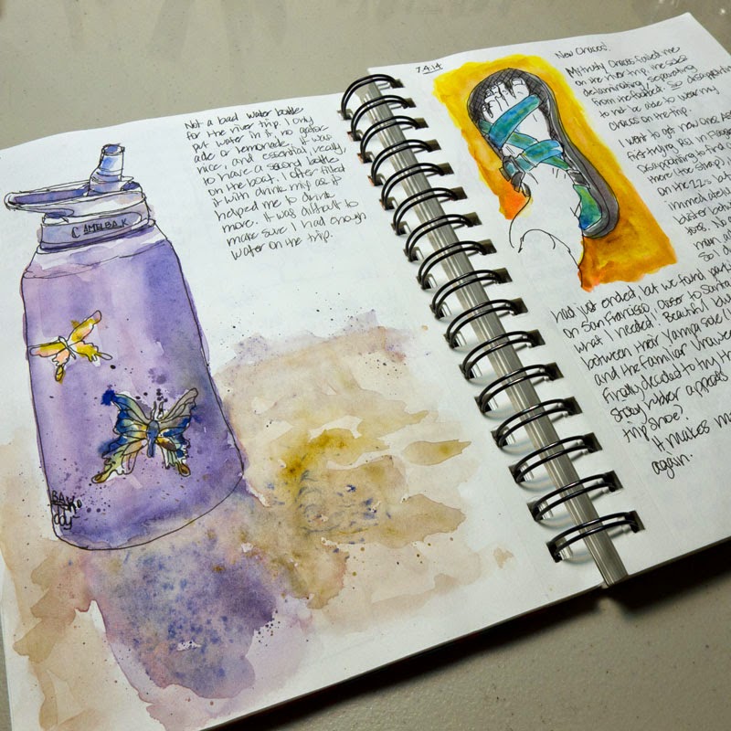
Finding the Sketchbook for Me, Finding Myself


Writing down my thoughts has come naturally to me all of my life.  I have been keeping a written diary/journal pretty much continuously since I was a girl, since I started my very first diary in 1975.  I still have that diary from 1975, by the way.  I have all of my diaries and journals though the years, because keeping a diary or journal has always been precious to me.  I learn about myself when I write out my thoughts and feelings, I work to solve my problems and issues, I take notes about what is happening in my life that I can refer to later if I forget.

Drawing and illustrating, on the other hand, is something I recently developed a habit of and I still feel like I am still in training for.  If you've been following me in this blog, you've seen me try my first sketchbook, and several thereafter, of all different types, makes, and models.  It taking me awhile to learn about this new part of myself and what works for me.  It feels like I've tried them all.

But I may have settled on a system that leaves me feeling content, a system that is working for me now.
You see, I've have recently learned about myself that I cannot keep an illustrated journal without wanting to write a lot of stuff right beside it.  I just can't let go of my love of writing.  I tried to not write so much, especially in sketchbooks that contained expensive paper meant for watercolor painting.  I tried keeping separate books, one I would sketch and paint in and one I would write in, but I didn't really like working in separate books, either.  It got too confusing having to decide what to put where, or where I put what.

I found that when I put pretty fabric over the cover of the Canson Universal Sketch book (my only real gripe about this particular sketchbook), I have found the perfect place for me to feel free to write AND sketch AND paint to journal my life.  The books are so cheap (less than $4 at Dick Blick for 100 sheets per 5.5x8.5" book) that I feel like I can put anything in them without "wasting" paper.  The paper is smooth with just a hint of tooth, and surprisingly strong for 65 lb paper.  When I draw or write in ink, it doesn't bleed or even show through to the other side.  And to my delight, it takes a layer or two of watercolor paints with only the slightest puckering!  When I paint on it, it's almost like painting on hot press paper, which I am really growing fond of.  I kind of like the splotchy effect I get with it!

The paper does get weakened if I work it too much with the brush though!  But this is a small drawback, especially since I have actual watercolor paper I can use whenever I want to make a "real" watercolor sketch or painting (which is something I do also pretty much every day).

I love that I can feel free to use it for a quick ink-only cactus and rock study outside, or to draw some thumbnail drawings to see if they could work design-wise in a future painting.  It's a place I can explore things on a whim, and write about the experience of doing it.


And it's a place where if I want to study value and not necessarily color, I can do that too!

What do I call this wonderful book where I feel free to put anything?  There are so many names people use for it:  sketchbook, artist's journal, illustrated journal, junk journal, or just--journal.

Whatever you want to call it, I am feeling happy right now that I have found a kind of book that I can feel free to do most anything in, and treasure later, in spite of the book itself being cheap, or maybe because of it...

Wednesday, June 11, 2014

My Compact Sketch Kit

I thought I'd share with you a compact kit I took with me on a recent 3-week trip that served me well, and I will take the same kit on our upcoming 16-day Grand Canyon river trip!
The bag is an Eagle Creek Pack-It Quarter Cube, and has a nice little carrying handle and a mesh cover. In the bottom I fit pens (Platinum Carbon Desk Pen and a Uniball Vision Micro), a mechanical pencil, 2 water brushes (fine and large), travel brushes (daVinci 1573 10 and 5), mini mister, pocket knife, reading glasses, stencil (bristle) brush for spatter, small piece of straw, 1/2 contact lens case holding a piece of kneaded erasure, and two small clips. I have a homemade palette from a Fisherman's Friend cough drop tin. Paper is a few sheets of 4x6" watercolor paper (in this case, Fabriano SP). I keep several more sheets of paper in a separate bag to refill this kit as needed. I have a piece of non-corrugated cardboard as a paper support, lined with contact paper and edged with artist tape. I clip a sheet of paper to the support when I sketch. I made a viewfinder from a piece of 4x6" watercolor paper to help me frame my compositions (I taped embroidery floss for the cross-hairs). The paper, support, and viewfinder are stuffed into an empty Canson watercolor 4x6" block. A Sea-to-Summit X-shot is used as a tiny collapsible water container. I usually I have a water bottle with me. Oh, and let's not forget a piece of Viva paper towel!
For those who are interested in knowing the paints in my palette, they are (starting at upper left): DS Hansa Yellow Medium, DS New Gamboge, DS Organic Vermillion, DS Q. Rose, DS Q. Violet, HB Manganese Blue Nova, DS Cobalt, DS French Ultramarine, DS Phthalo Blue GS, DS Phthalo Green BS, DS Yellow Ochre, DS Q. Burnt Orange, DS Burnt Sienna, WN Winsor Violet.
Here are some sketches I made during that 3-week road and river trip this May through California and Oregon:  
Agate Beach just south of Crescent City, CA

Rafts awaiting rigging along the Rogue River, Oregon

Along the Rogue River, Oregon

Sprekles Temple of Music, San Francisco, CA

Pacific Grove, CA

Joshua Tree National Park, CA