Saturday, August 2, 2014

Colorful Greens

Birds of Paradise, 8x10" ink and watercolor on Fabriano HP
As I prepared to paint these birds of paradise, I realized that I should try to make the greens more colorful than I usually do.  I had been reading Penny Soto's book Painting Glowing Colors in Watercolor in which she demonstrates a technique for underpainting then overpainting your subjects.  While I am familiar with underpainting, I am just now realizing how fun it is to make them really colorful!


Colorful underpainting complete
After drawing in the shapes of the leaves and flowers, I had some fun with underpainting the leaves.  I actually did two layers of underpainting.  The first layer was a very light wash of greenish yellow (New Gamboge + Manganese Blue Nova), with touches of Organic Vermillion, Quinacridone Rose, and Phthalo Blue RS mixed in to my wet washes.  This first layer was meant to show through for the light stems and veins of the leaves.  The second layer of underpainting was really fun, where I deepened the colors on the parts of the leaves between the veins.  Here I used a base of Winsor Violet and added Phthalo Blue for the deeper areas and Quinacridone Rose for the lighter areas (blending into clear water).

The photo shown with the underpainting complete also includes a dark background mix of all above colors.

Once the underpainting was complete, I worked on the colors in the flowers (mostly New Gamboge with some Organic Vermilllion), then the overpainting on the leaves.  For the leaf overpainting I mixed up a green from New Gamboge and Phthalo blue and lightly washed that over the leaf shapes.  The lighter areas got either mostly water or mostly New Gamboge, where the deeper areas got a higher concentration of the blue.

Once I was satisfied with the painting, I used my rapidograph pen to make the ink lines.

Photo credit for the birds of paradise goes to Nicke Reeves Payne.

Wednesday, July 16, 2014

Fun with my new Chacos

I'm a big fan of Chacos, I have been wearing them for 10 years. But I'm not the kind of fan that has to have 20 pairs of my favorite shoe--no just one pair is fine with me.

Well my favorite pair recently died on me, after nursing them along for 10 years with one resole and one re-webbing.  So I recently got new ones, and wanted to "commemorate" them with a painting.

I'm not that big into Still Life as an artist, but for Chacos I will make an exception.

 I set up some DIY lighting using a tripod, metal clamp-on light, and a plastic white table.
After drawing the outlines of the Chacos onto an 8x10" sheet of Arches 140lb cold press watercolor paper with pencil, I started painting.  It seems to me that getting strong light on your subject and capturing the value range is pretty important.  So I started by doing a purple under-painting (using Quinacridone Rose and Ultramarine) for the values.  I started exploring the blacks here also by adding New Gamboge to my mix.

When the under-painting and first blacks were dry, including a wet-into-wet of the three colors for the gray of the sole, I worked on the straps.  For them I used mixes of Manganese Blue Nova, Phthalo Green Blue Shade, and Ultramarine.

For the final touch I mixed up some wet puddles of the teal and the purple to load a brush with and create some splats.  Blowing through a straw at the resulting splat puddles created the radial lines.  A fun little commemoration for my beloved new Chacos.  May they last me another 10 years!

Monday, July 14, 2014

Finding the Sketchbook for Me, Finding Myself


Writing down my thoughts has come naturally to me all of my life.  I have been keeping a written diary/journal pretty much continuously since I was a girl, since I started my very first diary in 1975.  I still have that diary from 1975, by the way.  I have all of my diaries and journals though the years, because keeping a diary or journal has always been precious to me.  I learn about myself when I write out my thoughts and feelings, I work to solve my problems and issues, I take notes about what is happening in my life that I can refer to later if I forget.

Drawing and illustrating, on the other hand, is something I recently developed a habit of and I still feel like I am still in training for.  If you've been following me in this blog, you've seen me try my first sketchbook, and several thereafter, of all different types, makes, and models.  It taking me awhile to learn about this new part of myself and what works for me.  It feels like I've tried them all.

But I may have settled on a system that leaves me feeling content, a system that is working for me now.
You see, I've have recently learned about myself that I cannot keep an illustrated journal without wanting to write a lot of stuff right beside it.  I just can't let go of my love of writing.  I tried to not write so much, especially in sketchbooks that contained expensive paper meant for watercolor painting.  I tried keeping separate books, one I would sketch and paint in and one I would write in, but I didn't really like working in separate books, either.  It got too confusing having to decide what to put where, or where I put what.

I found that when I put pretty fabric over the cover of the Canson Universal Sketch book (my only real gripe about this particular sketchbook), I have found the perfect place for me to feel free to write AND sketch AND paint to journal my life.  The books are so cheap (less than $4 at Dick Blick for 100 sheets per 5.5x8.5" book) that I feel like I can put anything in them without "wasting" paper.  The paper is smooth with just a hint of tooth, and surprisingly strong for 65 lb paper.  When I draw or write in ink, it doesn't bleed or even show through to the other side.  And to my delight, it takes a layer or two of watercolor paints with only the slightest puckering!  When I paint on it, it's almost like painting on hot press paper, which I am really growing fond of.  I kind of like the splotchy effect I get with it!

The paper does get weakened if I work it too much with the brush though!  But this is a small drawback, especially since I have actual watercolor paper I can use whenever I want to make a "real" watercolor sketch or painting (which is something I do also pretty much every day).

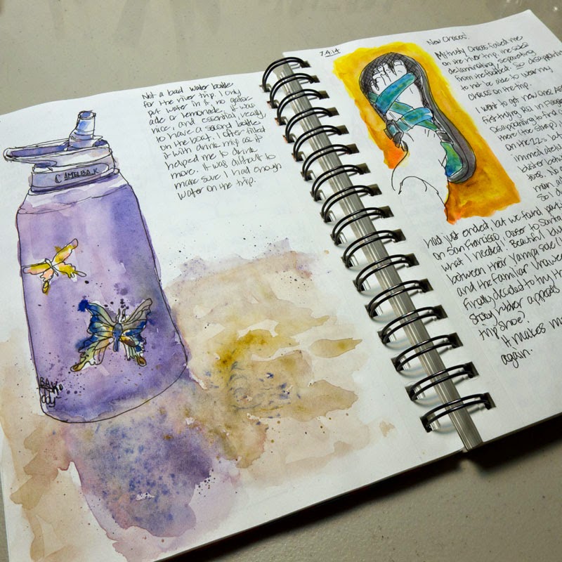
I love that I can feel free to use it for a quick ink-only cactus and rock study outside, or to draw some thumbnail drawings to see if they could work design-wise in a future painting.  It's a place I can explore things on a whim, and write about the experience of doing it.


And it's a place where if I want to study value and not necessarily color, I can do that too!

What do I call this wonderful book where I feel free to put anything?  There are so many names people use for it:  sketchbook, artist's journal, illustrated journal, junk journal, or just--journal.

Whatever you want to call it, I am feeling happy right now that I have found a kind of book that I can feel free to do most anything in, and treasure later, in spite of the book itself being cheap, or maybe because of it...

Wednesday, June 11, 2014

My Compact Sketch Kit

I thought I'd share with you a compact kit I took with me on a recent 3-week trip that served me well, and I will take the same kit on our upcoming 16-day Grand Canyon river trip!
The bag is an Eagle Creek Pack-It Quarter Cube, and has a nice little carrying handle and a mesh cover. In the bottom I fit pens (Platinum Carbon Desk Pen and a Uniball Vision Micro), a mechanical pencil, 2 water brushes (fine and large), travel brushes (daVinci 1573 10 and 5), mini mister, pocket knife, reading glasses, stencil (bristle) brush for spatter, small piece of straw, 1/2 contact lens case holding a piece of kneaded erasure, and two small clips. I have a homemade palette from a Fisherman's Friend cough drop tin. Paper is a few sheets of 4x6" watercolor paper (in this case, Fabriano SP). I keep several more sheets of paper in a separate bag to refill this kit as needed. I have a piece of non-corrugated cardboard as a paper support, lined with contact paper and edged with artist tape. I clip a sheet of paper to the support when I sketch. I made a viewfinder from a piece of 4x6" watercolor paper to help me frame my compositions (I taped embroidery floss for the cross-hairs). The paper, support, and viewfinder are stuffed into an empty Canson watercolor 4x6" block. A Sea-to-Summit X-shot is used as a tiny collapsible water container. I usually I have a water bottle with me. Oh, and let's not forget a piece of Viva paper towel!
For those who are interested in knowing the paints in my palette, they are (starting at upper left): DS Hansa Yellow Medium, DS New Gamboge, DS Organic Vermillion, DS Q. Rose, DS Q. Violet, HB Manganese Blue Nova, DS Cobalt, DS French Ultramarine, DS Phthalo Blue GS, DS Phthalo Green BS, DS Yellow Ochre, DS Q. Burnt Orange, DS Burnt Sienna, WN Winsor Violet.
Here are some sketches I made during that 3-week road and river trip this May through California and Oregon:  
Agate Beach just south of Crescent City, CA

Rafts awaiting rigging along the Rogue River, Oregon

Along the Rogue River, Oregon

Sprekles Temple of Music, San Francisco, CA

Pacific Grove, CA

Joshua Tree National Park, CA

Saturday, March 15, 2014

What do you see in your blobs?

One of the artists I admire and whose blog I've been following for some time is Karen Blados.  I was first drawn years ago to her precisely-drawn sketchbook pages, but in recent months I've noticed an evolution in her art.  Now I am seeing her be a lot more free with the paint, and it looks wonderful!  One particular post ("Kind of Controlled Chaos") gave me inspiration to try this for myself.  You start with paint blobs on your paper, then you construct a drawing in ink that is perhaps suggested and guided by the paint blobs themselves.  Then you further develop the painting with more paint and ink, all using your imagination as your guide (with a healthy dose of understanding where form shadows should go!).

I started with some paint blobs myself, using Permanent Rose and Opera Rose with touches of violet and yellow:


Though I would have loved to draw in cone flowers like Karen did in her work (I just love cone flowers!), that isn't what I saw in my blobs.  Instead I saw a different kind of flowers suggested by the blobs (I doubt these are real flowers!):


It was difficult for me to do this drawing based only on the blobs, because I am so used to using a live or photo reference.  But once that was done, then came the relatively easy part of deepening the colors and values on the flowers (and adding a leaf), then playing with a spatter for background:


This was freeing to do, though a bit of a stretch for me!  But fun because I could really amp up the color more than I might of if I had been using a real photo reference.  I recommend trying it!  What do you see in your blobs?

Visiting a Different Desert

We are back from a week in the deserts of California--a different, drier set of deserts than the relatively lush desert here in Tucson.  Since the mid-1990's we have occasionally enjoyed watching the professional tennis tournament at Indian Wells, now referred to as the BNP Paribas Open (it has been in previous years referred to as the Newsweek Champions Cup and the Pacific Life Open--it depends on who the sponsor is, I guess!).  So while there we often bookend our time watching tennis with camping and rock climbing at nearby Joshua Tree National Park.

What characterizes Joshua Tree NP the most in my mind are two unique features:  the gritty, fascinating (and fun to climb!) rock formations, and the Joshua trees the park is named after.  There are also palm tree oases in the park, but we don't often make to those areas as we focus mostly on the rock climbing.

Of course, while there I found many interesting sketch subjects!  My husband was very gracious in allowing me ample time to do this, usually in the mornings and evenings when the light is the best (and it's a bit too cold to rock climb!).  In the image at right, I started drawing the grouping of young Joshua trees just before dawn so by the time the sun rose over Ryan Mountain I was ready to paint the sunrise glow.  I then turned myself around to face the rock formation behind our camp, fully lit by the early morning sun.

While at the tennis tournament at Indian Wells I spent most of my time watching tennis, but I did manage to get a few sketches in too.  This year saw the unveiling of the new Stadium 2 facility, and while sitting in the stands one morning I sketched a portion of my view across the way.


Those familiar with the desert know that the nights can be quite chilly, even this close to spring.  I photographed my husband (in his down jacket) enjoying our nightly campfire.

Tuesday, February 18, 2014

It's Okay to Fail

The weather was great outside so I thought I'd go out to our backyard spa yesterday afternoon to sketch it, since one of the things going on these days is our search for a replacement spa cover.  I approached drawing this with a somewhat cavalier attitude...it's just a 4-sided spa, how difficult can it be?  And I held up my viewfinder and started drawing...in pen.

As you can see from the version on the left page, it didn't turn out so well!  Oops.  It's funny how the mind has trouble seeing what is actually there when it thinks it "knows" how it should be.  My mind tricked me!

So I realized that this attempt could not be salvaged, so I decided to leave it (as a cautionary tale) and start again.  Now that I realized that my brain can trick me, I took the drawing task more carefully, using pencil to mark cross-hair guidelines, dots of the corners of the spa, etc.  When I was sure I had the proportions relatively correct, I then drew in ink.  Much better.

It's okay to fail.  Sure, it's easy to regard it as a blemish in my book, but it teaches me something (that the mind can make assumptions about shapes and angles when I draw something, and I need to pay attention), and that is even more valuable than a perfect drawing!

Roz Stendhal recently had a blog post that is very relevant to my experience here:  Go Ahead and Fail Today.  In it she links to a wonderful video of Milton Glaser talking to us about the fear of failure.  If you are always successful, you do not develop in your endeavor, period!

Wednesday, February 12, 2014

Dealing with the challenges of Perspective

I want to share with you a drawing challenge I dealt with in today's journal entry--that of the challenges of perspective! 


Yesterday I was at a lovely outdoor mall and photographed an arched corridor that really caught my eye, both because of the vanishing point perspective, and also the wonderful light and shadows I saw (see below for a B&W version of the photo I took). 


I was really struggling with even being able to get my mind to SEE the key vanishing point lines, let alone draw them. I finally gave up, printed out my photo and put tracing paper over the photo and drew the key element lines, including some diagonal vanishing point lines (see below). 


Okay, NOW I can see better what is going on. I was then able to pencil in the pots and archways into my sketchbook, looking at the *traced* drawing rather than the confusing photograph, and I was able to do a much better job. I also put the tracing paper over my journal drawing from time to time to check my work. 

When satisfied, I inked in the drawing--what you see at the top. I will paint it tomorrow. I imagine many of you know how to deal with challenging perspective subjects, but this really taxed my brain!

Monday, January 27, 2014

Keeping Three Concurrent Art Journals

Ostrich in my everyday Artist's Journal
In your sketch practice do you like to keep just one sketchbook going or do you like to work in multiple sketchbooks at a time?

Inspired by Cathy Johnson's preference expressed in her wonderful book Artist Journal Workshop, I have been trying to get myself to keep just one journal going at a time.  What a lovely idea, everything drawn and written going into one book, a literal chronological journal of your life.

But as much as I've tried, I just can't seem to do that.

I just can't get over the tendency to let the paper inside the journal steer the content of that journal.  If I am just wanting to get some drawing practice in, or work out in pencil some ideas for this day's entry into my artist journal, why use watercolor paper to do it?  If I want to get some watercolor painting practice, it's much more enjoyable to use real artist-quality watercolor paper.  Between these two extremes is a basic desire to keep and maintain a daily illustrated journal of my life, or where I go, what I see, what I do, what I experience--the Artist's Journal.

I am finally coming to the understanding that for me, this means keeping (at least) three journals at the same time:

1.  The Junk Journal:  This is a sketchbook that contains sketch-quality paper (usually 65lb), where I feel free to get drawing practice, work out ideas, doodle...whatever.  It is also a place where I can feel free to get drawing practice by using copyright-protected photos from books, magazines, or the Internet, because this is not a book that is "mine", but merely a safe place to practice.  I learned about Junk Journals by reading Laure Ferlita's blog, and as far as I know she is the originator of the term.  I have decided for this I like to use a Canson Universal Sketch spiral-bound, because the paper can actually take wet watercolor washes without deteriorating or puckering the paper too badly.  To do the ostrich sketch above, I first practiced drawing the face in my Junk Journal to get a better understanding of it (using my photos at the ostrich farm at Picacho Peak as reference):


2.  The Artist's Journal:  This is my primary everyday journal, the one inspired by Cathy Johnson's book.  This is the one meant to provide a chronology of my life and interests, the book I will use to sketch in when I am on location or traveling, and the book I have fun and enjoy playing in.  In choosing the book to use, I have to have paper that will take pen-work well and handle watercolors "good enough" without frustration.  I have been keeping one of these types of journals for two years now, and I while I enjoy the Stillman & Birn sketchooks (and the Strathmore Mixed Media and Moleskine Watercolor), I think I might prefer my homemade coptic-bound books with student-quality watercolor paper (Strathmore 400 140lb cold press or Strathmore Aquarius II).  Another recent entry into my Artist's Journal (currently a Stillman & Birn Alpha Series sketchbook):

3.  The Watercolor Painting book:  After watercolor painting on less-than-ideal sketchbook paper exclusively for over two years now, I find that I am getting a bit hungry to get more time in painting on "real" artist-grade watercolor paper.  I recently tore up a couple full sheets of my Arches 140lb paper into 7x10" size and had it spiral-bound at Stables.  I am hoping working in a book like this will help me get better at more "fine art" watercolor painting efforts.  Why in a book?  Well, way back when, when I was doing only watercolor paintings, my stack of loose watercolor paintings in the closet was becoming larger than I could manage.  To me, putting the paintings into a book feels right, feels contained.  But I am already finding that working real paintings in an already bound book has it's limitations (can't tape down the sheet to a board to make sure it dries flat, for one), so once I finish this particular book, I think I will work in loose sheets first, then bind the finished paintings into a book.  Here is the first entry into this Arches paper book, from a photo I took during our 2009 trip to Alaska:


So, because of my particular needs, right now it feels right to keep 3 concurrent art journals.