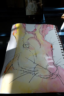
I've had a request to provide a step-by-step of how I've been drawing and painting my animal portraits (you can view some of them
here on Flickr), so here we go!
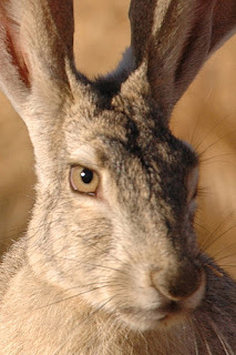
The first step is finding a good photograph. I enjoy really studying the animal's face, particularly if I like the animals expression, so I need a photograph that will show the face clearly. It's a bonus if there are some interesting light and shadows on the animal. I have been able to take some nice photographs of animals at our local zoo, but for the purposes of this tutorial I shall use a photo that anyone can access. One marvelous source of copyright-free photographs is the National Image Library of the US Fish and Wildlife Service. Many of their images
are in the public domain so they are free to use as artist reference. The gateway to their collection is
here, but note also at the top of the page links to various Flickr pages.
 |
| 4x6" crop of the USFWS photograph |
For my tutorial I chose a
photograph of a Blacktail Jackrabbit taken by Scott Rheam of the USFWS. I've checked in the description and it is indeed an image that is in the Public Domain. Yay! I love jackrabbits! I like the expression on this ones face. However, I feel compelled to change the composition of the photograph to really focus on the face, so I crop the image using Photoshop Elements. I know the final sketch in my sketchbook will be 8x12", which is a 2:3 aspect ratio. I set up the crop parameters to 4" wide by 6" tall in Photoshop so it will end up cropped to my desired
aspect ratio.
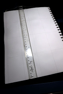 |
| Draw a grid on your sketch page in pencil |
So now I have a photograph to work from, let's begin! Though many times I draw totally free-hand, I find I do a better job drawing if I use the grid method of drawing, and since I like my animal faces to look representative, at least structurally, I go ahead and do that. I draw my grid lines on the paper lightly with pencil. My sketchbook is 9x12" in size (Strathmore Mixed Media Visual Journal), so I first draw a line using a t-square about 1/4" or so from the holes made for the spiral binding. I then measure and draw a line 8" from that. Now I make little tick marks at 2", 4", and 6" along the short (8") side, and at 3", 6", and 9" along the long (12") side. Then using my t-square I draw the lines at the tick marks. This divides my sketching area into a 4x4 grid.
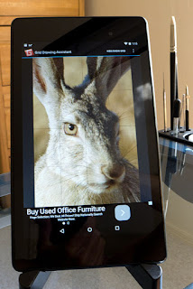 |
| Reference photo on Android tablet |
Now I turn to the wonders of today's technology. My husband got me a Nexus 7 tablet for my birthday a couple years ago and I love it! It's a wonderful way to look at reference photographs without using any printer ink! And there are Andoid apps available that are helpful to artists. Here I am using the free app called Grid Drawing Assistant, which allows me to overlay a grid (of my specification) onto any photograph.
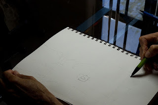 |
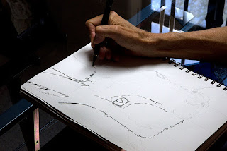
| Pencil rough sketch |
I could at this point go right in with ink, but I instead cautiously block out the basic shapes in pencil, always noticing where the lines, features, and shapes in the photograph are relative to the grid lines in the app and on my paper. I am using my Ohto Comforcil 2.0mm lead holder, with 2B lead in it, which is easily erasable with a kneaded erasure.
 |
| Inking with a Kuretake Brush Pen |
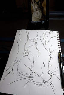
When I am satisfied with the rough sketch, I start drawing in ink. For many years I've been content with fine ink lines provided by my Lamy Safari EF fountain pen (filled with Platinum Carbon Black ink, which is waterproof), or other fine-tipped technical or fountain pens. But lately I've been exploring the brush pen and I am really enjoying the expressive lines you can achieve with those. You can get a range of line widths, from super fine to very bold, depending on how you handle the pen. The pen I am using is a recently-acquired Kuretake No. 13 Fountain Brush Pen. It comes with ink that is NOT waterproof, so I filled a Platinum Converter I had with Platinum Carbon Black ink instead. When I am finished and it has had time to dry, I used my kneaded erasure to erase the rough pencil sketch and the interior grid lines, keeping the two vertical side lines (though I think this photo was taken before I did the erasing!):
 |
| Inking with Brush Pen Complete |
 |
| Yellow and Rose Underpainting |
There is a highlight in the eye of the rabbit, so for convenience I put a dab of masking fluid where the hightlight should go.
Now starts the next phase, watercolor painting! Since I am working in my studio (rather than on site) and I have plenty of time, I go ahead and do an underpainting first. I learned this technique from artist Jonathan Frank and I have really been enjoying the results. Basically, I use a warm yellow (Daniel Smith New Gamboge was my favorite until they discontinued pigment PY153 so I am turning to Da Vinci Hansa Yellow Deep PY65) and a rose (Quinacridone Rose PV19). I "map" the two colors according to areas of light and shadow as dictated by the values in the photograph, letting them mingle as they will. I do this no matter what the final local colors will be.
While this is drying I need to figure out what my palette will be for this guy. What will be the pigments I use? Here is where I feel the most out of my comfort zone, because I like to experiment and try new things and I usually don't feel like I know what I'm doing. My vision for my art is to make things colorful and interesting, and harmonious. I study other people's art that I really like and try to figure out what palette they are using for that particular piece of art. One of my favorite animal portrait artists is
Amy Ringholz, and I've been studying her works to try to look at options for my color palette (she is an oil painter, but I think it can translate to watercolor okay). On one wolf painting of hers I was inspired to try out what I discerned to be a similar color palette in my color journal:
 |
| Color palette inspired by Amy Ringholz |
So the paints in this palette are: New Gamboge (or Hansa Yellow Deep), Quinacridone Rose, Quinacridone Violet, DS Monte Amiata Sienna, Phthalo Blue Red Shade, and Cobalt Teal Blue. I explore some mixtures, but for this rabbit I decide to go for general warm tones of siennas and neutralized greens. And of course purples using Phthalo Blue and Rose or Violet.
I use those purples to further map the shadows on the face, stroking in color and softening them with a separate damp brush. I am using a couple of size 12 brushes:
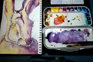 |
| Purples to map the shadows |
I used a greenish yellow for the iris of the eye. When that dried, it was time to finally suck it up and work on the local color using the siennas and greens I was telling you about. It's kind of hard to do because I have to
imagine them, as they are not easily seen in the photograph itself. But I take a deep breath and dive in, with a flurry of intuitive strokes, mixing, and softening the strokes with a clean brush. I also paint the pupil of the eye, cheating to get a nice black by using Payne's gray mixed with Quinacridone Violet. This is the result of putting in the local color:
 |
| Local color painted |
Whew, that wasn't so bad! So I take another relaxing calming breath now that that's over and think about the background. My rabbit is generally light, and I tend to love dark backgrounds, so I decided on a dark blue-toned background. I try to keep within the color palette that I'm already using. Phthalo blue is a powerful pigment and a good base for a background here. I neutralize it by mixing in the Quinacridone Violet, Quinacridone Rose, and Hansa Yellow Deep. While the wash is still damp I spritz it with rubbing alcohol to get some texture.
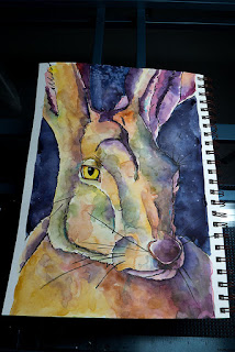 |
| First layer of background |
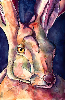
I think I'm almost done! I decide the background needs more intensity, so after it dries I glaze a layer of Phthalo Blue onto the background. I remove the masking fluid from the eye highlight, date the sketch, and I am done! The final sketch is at the top of this tutorial.
I hope this step-by-step tutorial was helpful to you!

 The first step is finding a good photograph. I enjoy really studying the animal's face, particularly if I like the animals expression, so I need a photograph that will show the face clearly. It's a bonus if there are some interesting light and shadows on the animal. I have been able to take some nice photographs of animals at our local zoo, but for the purposes of this tutorial I shall use a photo that anyone can access. One marvelous source of copyright-free photographs is the National Image Library of the US Fish and Wildlife Service. Many of their images are in the public domain so they are free to use as artist reference. The gateway to their collection is here, but note also at the top of the page links to various Flickr pages.